
I often tease Tom for being a “type-nerd”. It’s not unusual to hear things like, “I can’t
believe they used (insert font here) on that billboard” or “The kerning on that
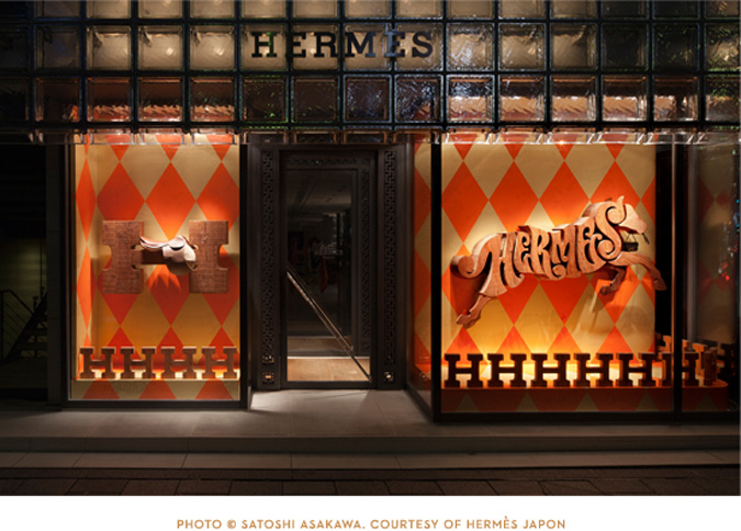
poster is ridiculous" on a daily basis. Actually, it's rubbed off on me a bit and now I find myself noticing things like that more and more. So I wasn't surprised when he sent me a link to the House Industries designed windows for Hermes Tokyo. It's the perfect combination of font-meets-fashion.
Every year he takes his design students on a field trip to House Industries since their headquarters are located in not-too-far-away Delaware. If you're a designer and haven't checked out their fonts then drop what you're doing and check them out right now. It's enough to turn me into a bit of a type-nerd myself.

Every year he takes his design students on a field trip to House Industries since their headquarters are located in not-too-far-away Delaware. If you're a designer and haven't checked out their fonts then drop what you're doing and check them out right now. It's enough to turn me into a bit of a type-nerd myself.
2 comments:
I always notice fonts too! One time I saw church use comic sans and I shuddered - it really was that bad. The Hermes window here is gorgeous!
ohhh....what a window! Gorgeous!!
Post a Comment